13 Statement Front Door Paint Colors Inspired by Luxury Boutique Hotels
Front door colors offer powerful design opportunities, where bold paint choices inspired by luxury hospitality create confident, sophisticated entries that communicate refined taste while transforming ordinary facades into memorable, architecturally significant presentations.
These carefully curated hues, borrowed from world-class hotels, demonstrate that color selections transcend mere personal preference, reflecting deliberate design strategies in which psychological impact, architectural harmony, and cultural sophistication intersect, creating entries that impress and welcome simultaneously.
Strategic color selection incorporating undertones complementing existing exterior materials, intensities appropriate for architectural styles, and quality paint formulations ensuring lasting beauty creates doors that enhance property value while establishing immediate curb appeal that distinguishes properties from surrounding homes.
Understanding color psychology influencing visitor perception, how natural light affects color appearance throughout days, and which hues maintain relevance beyond fleeting trends ensures paint investments deliver lasting value rather than requiring premature repainting when initial enthusiasm fades.
These thirteen statement door colors demonstrate sophisticated approaches inspired by luxury design, each proving that thoughtful color selection creates disproportionate impact relative to these singular architectural elements, making door painting among the most cost-effective facade improvements available.
1. Classic Navy Blue Timeless Sophistication
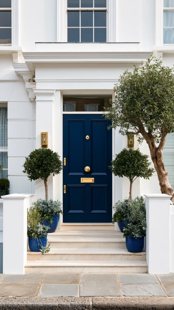
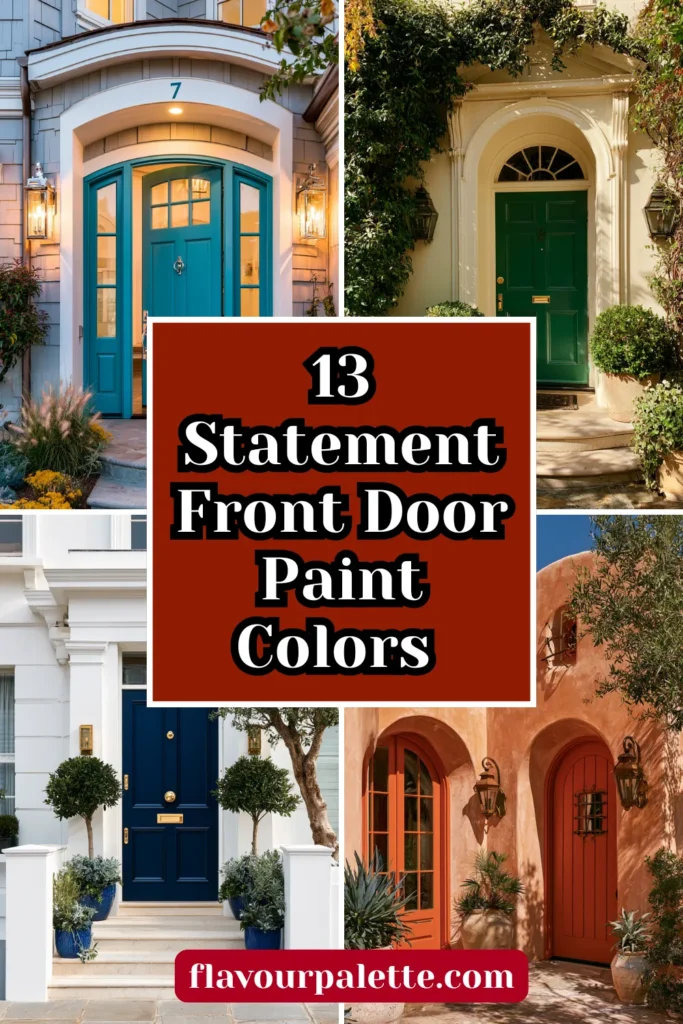
Embrace the navy blue favored by luxury coastal resorts, where this deep saturated hue creates sophisticated drama, providing strong contrast against white or light siding, while the classic maritime association adds refined elegance.
Choose true navy, avoiding black-leaning or purple-undertone variations, use high-quality exterior paint ensuring color saturation withstands sun exposure, and pair with polished brass or chrome hardware, creating classic combinations.
The navy creates an immediate architectural presence while the deep color suggests confidence and traditional refinement. The timeless hue transcends trends, ensuring lasting relevance, while the sophisticated tone communicates quality and attention throughout properties. The versatile shade suits varied architectural styles from colonial through contemporary, demonstrating universal appropriateness.
2. Glossy Black Contemporary Elegance
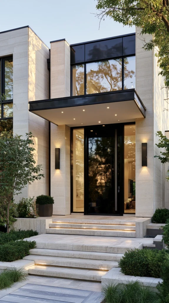
Install high-gloss black doors inspired by urban boutique hotels where the dramatic darkness creates striking modern statements, providing maximum contrast while the reflective finish adds sophisticated sheen, suggesting luxury materials.
Select true black in high-gloss or semi-gloss finishes, creating reflective surfaces, ensuring proper surface preparation, achieving smooth applications, and coordinating with modern hardware in brass, gold, or stainless steel.
The black door creates a powerful graphic presence while the glossy finish reflects light, adding dimensional interest beyond flat surfaces. The modern character suits contemporary architecture while adding an updated edge to traditional homes. The neutral darkness coordinates universally, while the bold choice demonstrates design confidence.
3. Emerald Green Jewel Tone Richness
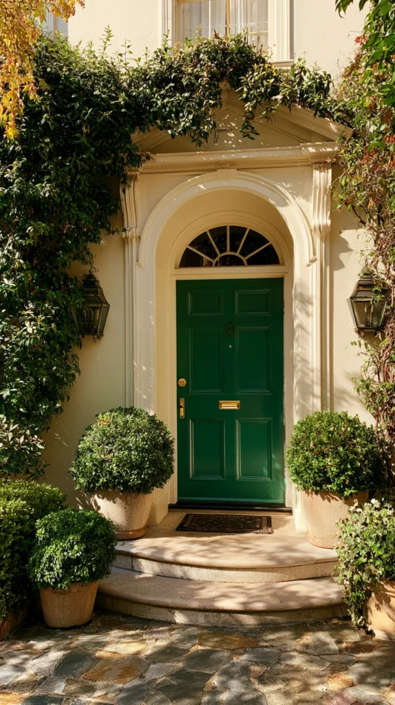
Introduce luxurious color through emerald green doors inspired by garden-view hotel suites, where this rich jewel tone creates sophisticated natural character, balancing boldness with organic restraint.
Choose saturated emerald, avoiding yellowy or blue-leaning greens that date quickly, test extensively since green shifts dramatically in varied lighting, and pair with brass or gold hardware, enhancing the jewel-like quality.
The emerald creates a memorable character while the natural reference feels organic rather than artificial. The jewel tone suggests luxury and quality, while the green maintains enough neutrality, coordinating with varied facade colors. The sophisticated shade demonstrates design knowledge beyond safe neutral choices.
4. Deep Burgundy Wine Richness
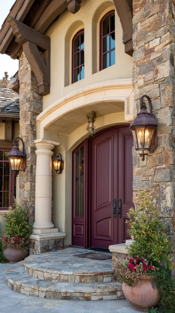
Create warm, sophisticated entries through burgundy doors inspired by wine country estates, where this deep red-purple creates welcoming warmth while the complex color demonstrates refined taste, transcending basic primary red.
Select burgundy with balanced red and purple undertones, avoiding overly brown or pink variations, appreciate how the deep tone creates rich character, and coordinate with traditional brass or oil-rubbed bronze hardware. The burgundy provides warmth and welcome, while the sophisticated complexity elevates beyond simple red doors.
The rich tone suits traditional architecture particularly well, while the depth prevents the bright primary quality that can feel unsophisticated. The warm color creates an inviting character, suggesting hospitality.
5. Charcoal Gray Modern Neutral
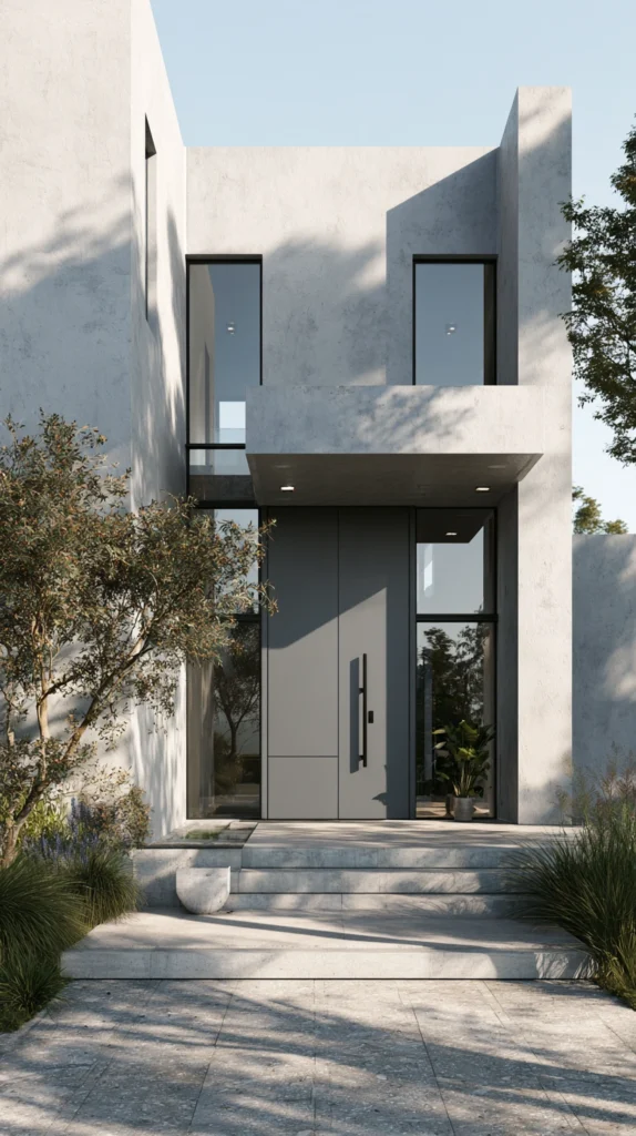
Embrace contemporary restraint through charcoal gray doors inspired by minimalist urban hotels, where this near-black neutral creates sophisticated modern character, providing drama without the starkness that pure black sometimes presents.
Choose deep charcoal with neutral undertones, avoiding those reading too blue or brown, select matte or satin finishes creating contemporary non-reflective surfaces, and pair with modern hardware in stainless steel or matte black.
The charcoal creates a substantial presence while maintaining technical neutrality, allowing coordination with any facade color. The sophisticated gray demonstrates modern sensibility, while the depth prevents the weakness that pale grays sometimes project. The contemporary character suits modern architecture perfectly.
6. Vibrant Coral Statement
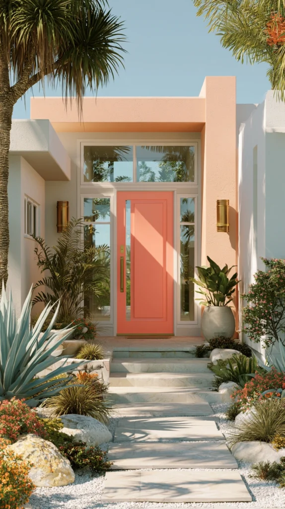
Make bold, optimistic statements through coral doors inspired by tropical resort destinations where this warm pink-orange creates cheerful, sophisticated character, demonstrating design confidence and personality.
Select true coral balancing pink and orange undertones, avoiding those reading too salmon or peachy, test extensively, ensuring the vibrant hue suits specific facades, and pair with brass or natural wood elements, complementing the warm tone.
The coral creates immediate, memorable character while the cheerful warmth suggests hospitality and welcome. The bold choice demonstrates confidence, while the sophisticated tone prevents the childish quality that brighter pinks might create. The distinctive color ensures properties stand out memorably.
7. Rich Teal Blue-Green Balance
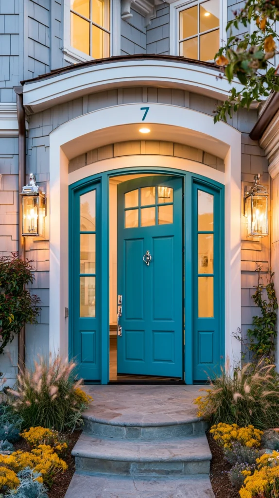
Create distinctive entries through teal doors inspired by coastal Mediterranean hotels, where this complex blue-green creates sophisticated character that feels both traditional and contemporary through its balanced complexity.
Choose teal with equal blue and green presence, avoiding those leaning too heavily in either direction, appreciate how the complex color creates depth and interest, and coordinate with varied hardware finishes, including brass, chrome, or oil-rubbed bronze.
The teal provides distinctive character while the blue-green balance creates versatility, coordinating with both warm and cool facade tones. The sophisticated complexity demonstrates color knowledge, while the balanced nature prevents the dated quality that purely green doors sometimes possess.
8. Classic Brick Red Traditional
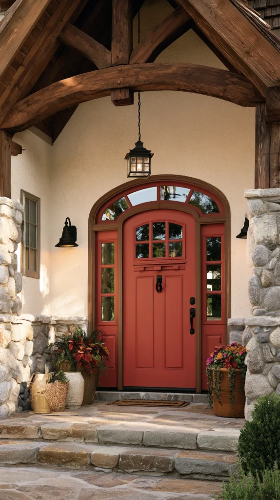
Honor traditional architecture through brick red doors inspired by heritage properties, where this earthy, warm tone creates classic character, referencing historical color palettes while maintaining contemporary relevance.
Select brick red with balanced orange undertones, creating authentic clay references, appreciate how the traditional tone suits colonial and craftsman architecture particularly well, and pair with traditional brass or black hardware.
The brick red creates warm traditional character while the earthy tone coordinates naturally with varied exterior materials. The classic color communicates respect for architectural history, while the warm tone creates a welcoming, approachable character. The timeless choice ensures lasting relevance.
9. Sophisticated Slate Blue-Gray
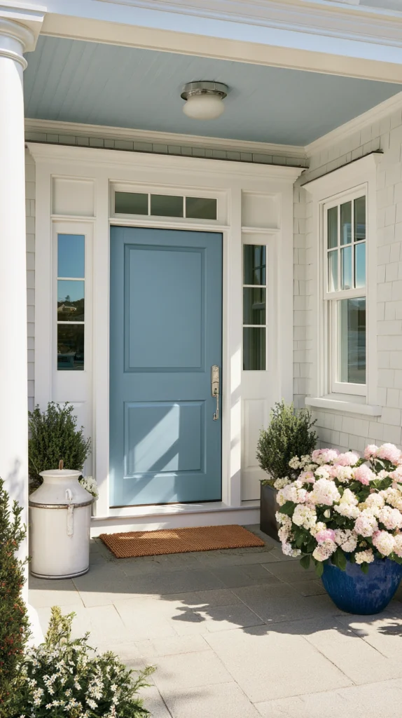
Develop refined entries through slate blue-gray doors inspired by New England coastal inns, where this cool, sophisticated tone creates understated elegance, providing color while maintaining restrained neutral qualities.
Choose slate tones balancing blue and gray, preventing either from dominating, test in actual conditions since this subtle color shifts noticeably in varied light, and coordinate with brushed nickel or chrome hardware, complementing the cool tone.
The slate creates sophisticated color while maintaining enough neutrality, ensuring broad coordination. The cool tone suits homes in naturally wooded settings, while the restrained intensity demonstrates confident subtlety beyond bold statement colors.
10. Warm Terracotta Earth
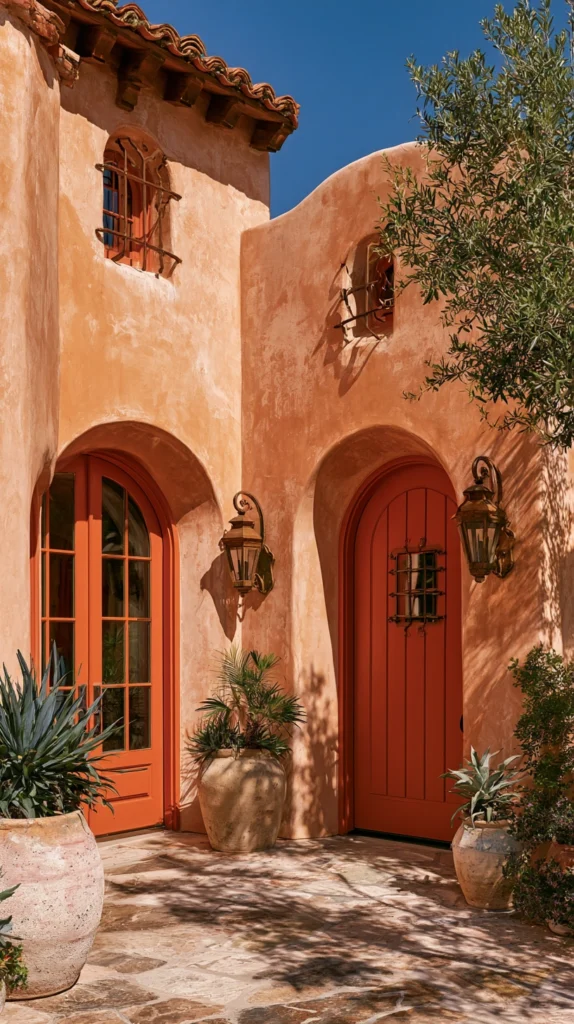
Introduce Mediterranean warmth through terracotta doors inspired by Tuscan villas where this earthy orange-brown creates organic character suggesting sun-baked clay and historical architecture.
Select terracotta balancing orange and brown undertones creating authentic earthen references, appreciate how the warm tone suits southwestern, Mediterranean, and even craftsman architecture, and coordinate with natural materials and warm-toned hardware.
The terracotta creates distinctive warmth while the earthy quality feels organic and grounded. The historical reference adds cultural depth while the warm tone creates approachable welcoming character. The distinctive color creates memorable entries.
11. Deep Forest Green Natural
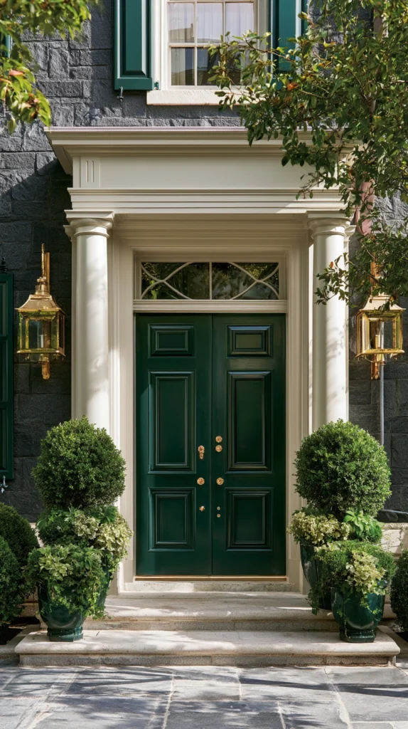
Create organic sophisticated entries through forest green doors inspired by woodland retreats where this deep natural tone provides substantial presence while maintaining clear nature connection.
Choose forest green with adequate depth avoiding pale or yellowy greens that lack presence, appreciate how the natural color coordinates with landscaping and surrounding foliage, and pair with traditional hardware in brass or oil-rubbed bronze.
The forest green creates natural character while the substantial depth prevents the weakness that pale greens sometimes project. The organic reference creates environmental harmony while the classic tone ensures lasting relevance. The natural association creates calming welcoming character.
12. Bright White Fresh Classic
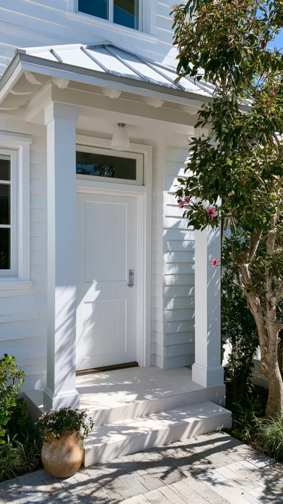
Maintain perpetual freshness through crisp white doors inspired by Greek island villas where this clean neutral creates the ultimate bright welcoming character that feels perpetually appropriate regardless of surrounding trends. Choose pure bright white avoiding cream or off-white variations that appear dingy, maintain through regular cleaning and touch-up painting, and pair with any hardware finish creating universal coordination.
The white door creates maximum brightness and welcome while the classic neutral ensures coordination with any facade color or architectural style. The timeless choice never dates while the bright color creates positive optimistic character. The universal appropriateness makes white the safest sophisticated choice.
13. Sophisticated Slate Blue Traditional
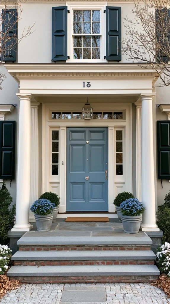
Develop refined entries through slate blue doors inspired by New England heritage properties where this cool sophisticated tone creates understated elegance providing gentle color while maintaining restrained classical qualities. Choose slate blue with gray undertones creating sophisticated muted character, appreciate how the traditional tone suits colonial and craftsman architecture, and coordinate with traditional brass or pewter hardware.
The slate blue creates gentle color while the sophisticated restraint demonstrates refined taste beyond bold statements. The cool tone provides color interest while the muted intensity maintains classical appropriateness. The traditional association creates timeless character.
Successfully selecting statement door colors requires testing extensively on actual doors in natural light conditions, observing how colors appear throughout days and seasons, coordinating with existing exterior materials, ensuring harmonious rather than clashing combinations, and choosing quality exterior paints formulated specifically for door applications, withstanding weather and use.
Consider architectural context, ensuring colors complement rather than conflict with home styles. Evaluate surroundings, understanding how doors appear within broader neighborhood contexts. Assess maintenance requirements honestly, understanding that darker colors show scratches while lighter tones require more frequent cleaning.
Balance personal preferences with resale considerations, ensuring bold choices appeal broadly rather than limiting market appeal. Prepare surfaces properly, ensuring paint adhesion and longevity. Use proper techniques to achieve professional, smooth finishes.
Most importantly, recognize that front door colors create powerful first impressions where thoughtful selection inspired by luxury design creates sophisticated, welcoming entries that enhance property value while demonstrating refined taste, proving that these singular architectural elements deliver disproportionate impact through strategic color choices that transform ordinary entries into memorable, sophisticated presentations worthy of properties they represent.